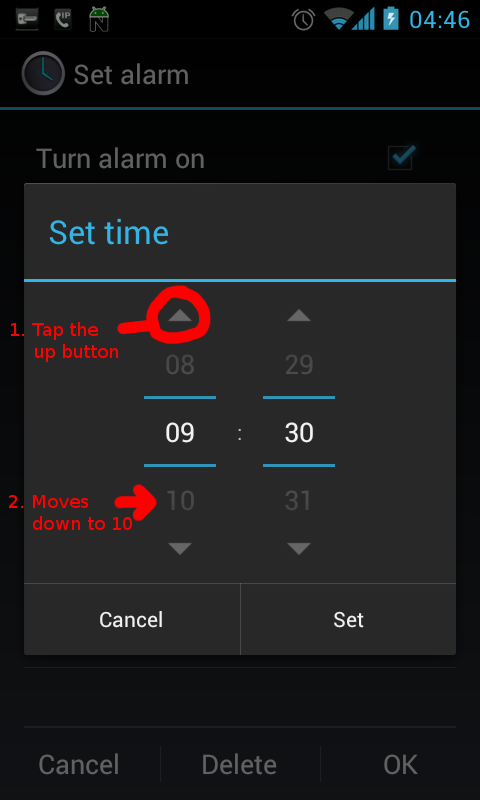
I like Android, but there are a few times the UX (User Experience) is a bit messed up compared with the way the user thinks. For example, take the newly introduced alarm clock time selection interface added in ICS:
So the alarm time selection gives me the ability to drag the time up/down, simple enough, most users understand dragging on touch screen devices. However if one decides to tap the up/down buttons instead…
I guess the developer decided that the up button should increase the time and the down should decrease which would make sense if it wasn’t for the fact that the user can see the preceding and following numbers which changes their perspective from the arrows being for numerical incrementing to the arrows being for sliding/rotating the displayed numbers on screen.
It’s even more annoying since it worked logically on pre-ICS devices only to be changed and broken in this confusing manner. :-(

I found this very annoying too.
I find it is easier to ignore the arrows altogether and swipe over the numbers which act like dials.
And, upon checking, it appears they have removed the arrows in Jelly Bean. Nice.