As you undoubtedly know, I’m one of Microsoft’s biggest fans [1], so I eagerly downloaded the newly released Windows 8 Developer Preview to take a look at what they’re aiming to with Windows 8.
This post is just based on a quick look as someone who runs Linux 24×7 for everything, has a lot of familiarity with Windows XP as a user and admin, some Windows 7 user-level experience and without looking through the online resources or keynotes about new capabilities – a pure “fire it up and see what happens” test and figuring out things as I go along.
[1] OK, maybe not really. [2]
[2] OK, so maybe I hate the company, their proprietary products and culture of lock-in. [3]
[3] Fuck Em
Environment
To begin with, I downloaded the 32bit OS ISO – mainly because the memory requirements and download sizes are less than the 64bit release and I wanted to see how it would go with 1GB RAM – an amount not unreasonable to expect on lower power tablet computers currently on the market.
I installed it onto my RHEL 6-based Linux KVM server (Kernel-based Virtual Machine, a fantastic virtualisation platform shipped with the Linux kernel and packaged into a number of distributions such as RHEL 6).
I didn’t bother looking for any paravirtualised I/O or networking drivers for Windows 8, so the guest was running on emulated IDE hardware, thus ensuring that I/O would not have anything resembling performance, so I haven’t critiqued Windows 8 for performance at all in this review. :-)
Apparently a lot of people have had problems trying to run Windows 8 on VMWare, but Linux comes through again as an impressively capable platform for virtualisation. [4] :-)
[4] To date, KVM has virtualised for me: Linux, Windows, BSDs, Minix, HaikuOS, several large routing companies OSes and more. :-)
Installation
Installation was typical as per any OS installation from ISO media – virt-install read the ISO fine, launched the windows installer and proceeded to install with a very Windows 7 like installer.
It did “feel” faster than a Windows 7 installation onto the same platform I did recently, however that is purely anecdotal and may be impacted by 32bit vs 64bit install size differences.
After the base installation, typical reboot happened, although it appeared to cause my VM to shutdown rather than reboot – after powering back on, Windows 8 proceeded to take me through the re-done setup screens.
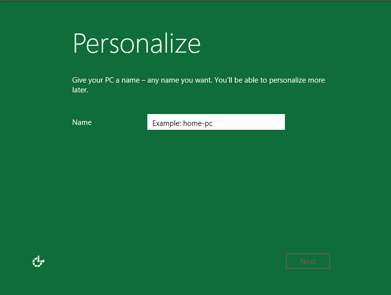
It’s a big change from previous install screens – looks like Microsoft pretty much tossed out the UI and started again, basing everything around the colour green.
However it does appear they’ve lost some UI concepts in the process – for example, in the above screen I needed to set a computer name – but clicking in the name field didn’t display me a cursor, nor did the example text vanish, typical responses of most current OSes.
I also found that Windows 8 would refuse to take “devel-win8-pre32” as a hostname, considering it too long – this isn’t really a problem for your average home user, but drives a power user like me up the wall – I want hostnames that suit *my* desires damnit!
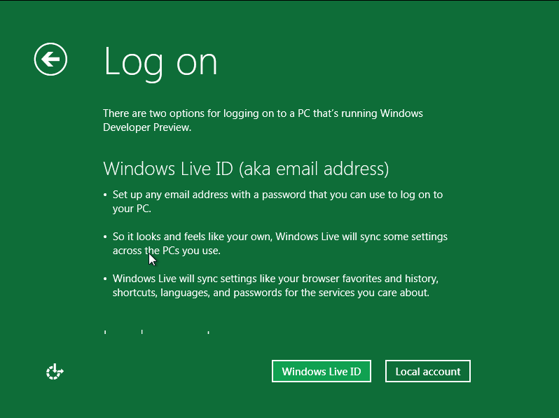
Taking a leaf from Apple, or even Google's Android, Microsoft is tying the OS to their online services - although the paranoid can bypass - for an average users, the synchronization features sound like a nice touch.
Not being a Windows Live user (I have an account lying about for occasional use, but not for anything important) I originally tried to bypass the Windows Live registration step, but found that the installer crashed out with an error later on when I did.
After retrying with an “advanced/custom” configuration behaviour and using Windows Live it worked successfully – or at least it didn’t complain about anything I entered, I’m still a little unsure as to whether it logged into an existing account or just created me a new one.
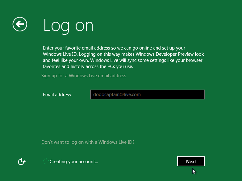
Some UI confusion there - Windows tells me it's creating my Windows live account, but that account already existed....
Being impatient with a GUI OS not giving me any nice console messages to read (like any nix geek really – everyone wants to know what the OS is busy doing!!) I started clicking impatiently and was rewarded with a nice placeholder screen:
(It’s actually a major improvement – impatient clicking is the leading way I cause Windows desktops to fall into performance hell, many a time I have attempted to do too many tasks on a Windows XP system to have everything in the OS crawl to a halt, because it can’t handle the usage patterns I’ve picked up from my Linux environment.)
The Windows 8 UI did feel quite sluggish under the VM, but this is something I’ve noticed with Windows 7 as well – suspect it’s due to the newer UI/rendering in their GUIs which doesn’t play nicely with the un-accelerated 2D VM viewer sessions, rather than any actual fault with Windows.
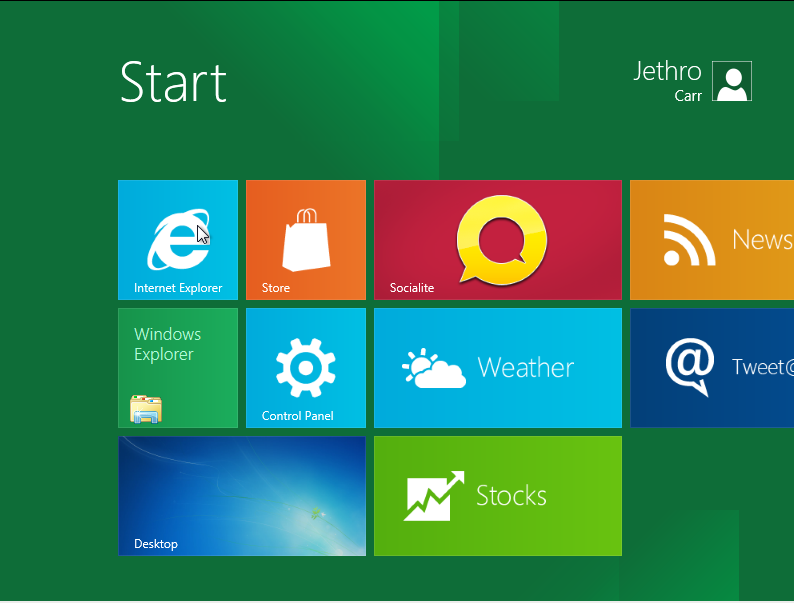
Despite my best efforts to break it, it eventually completed and I ended up at the shiny new Windows 8 “Metro Style” home screen. :-)
Operation
First impressions of Windows 8 is the new Metro style interface – it’s essentially a number of large clickable buttons in a minimalistic style UI – upon clicking a button, it’s application is launched in full screen mode – with a roll over application-specific popup below.
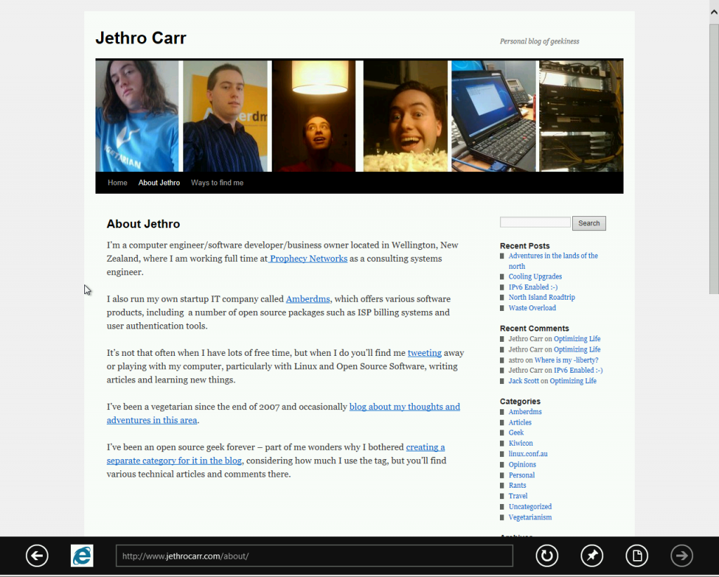
Metro-aware applications launching in fullscreen - in this case, IE accessing my site - note the minor scrollbar and the popup black bottom OS menubar.
The first thing you’ll notice is the very tablet inspired UI – whilst navigable with a mouse, more conventional UI designs are probably still faster/easier to work with – although this is something that may change after a lot of use.
However with touch, this must change a lot – it will be interesting to hear about detailed reviews from users of touch devices with Windows 8.
I did note the non transparent IE icon on the black bar sticking out awkwardly – maybe MS is still having trouble with image transparency in browsers…. :-P
The biggest issue I have with the UI is actually how to get out of it – I found that by moving my mouse to the bottom left corner, the windows start menu – or at least, what remains of it – pops up in a very web-like fashion and you can click to return to the main home page or perform a number of other tasks.
But not always – I managed to get myself trapped inside a paint program that kept blocking the mouse action to get the start menu – and without any windows keys, I was left only with CTL+ALT+DEL to rescue myself.
The other main issue for me with Metro, was that I *couldn’t* figure out initially how to actually launch conventional programs – since only new metro applications appear on the home screen.
Turns out you now “search” for the programs that you want, or be presented with an alphabetically sorted list – it will be interesting to see how it looks after a user installs 50 conventional applications with half a dozen menu items each, but search does seem to be the way that a number of user interfaces are pushing people towards.
I guess I’m a somewhat old school user who likes my hierarchical menus rather than search – for that reason even some of the newer Linux GUIs cause me pain – but I can respect that the design of these UIs probably aren’t aimed towards people like me.
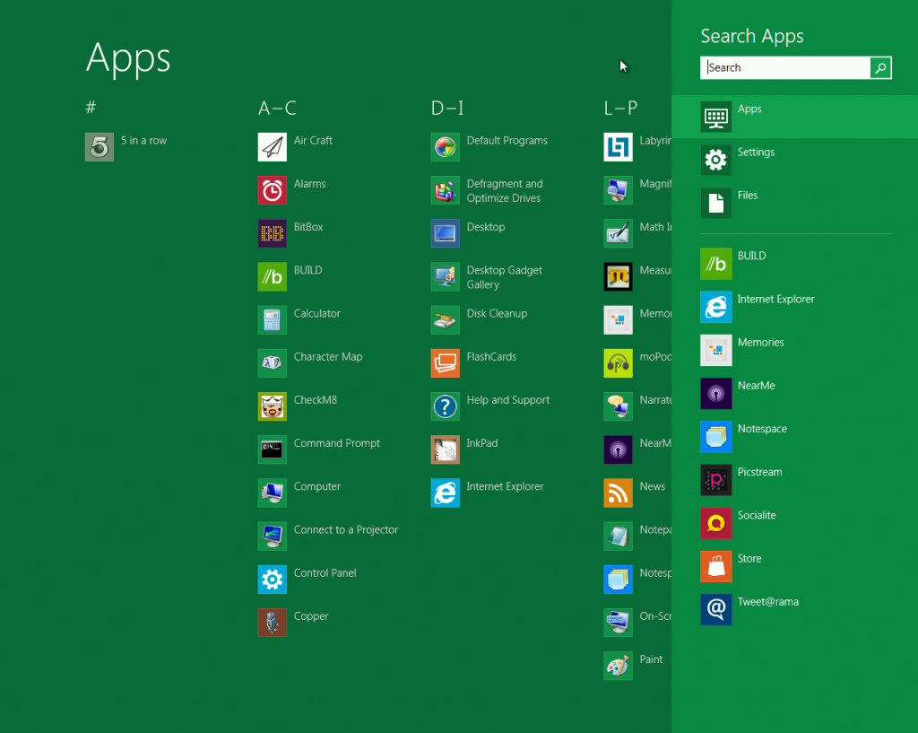
This is your punishment for loving Google too much, all your UIs will be replaced by search boxes! Mwhahah, search everything! Eventually you'll be searching for search tools to do your searching!
Oh and BTW – don’t rely on the search box – I tried to search for “shell” but didn’t get either traditional command line nor Powershell – not sure what’s happening there….
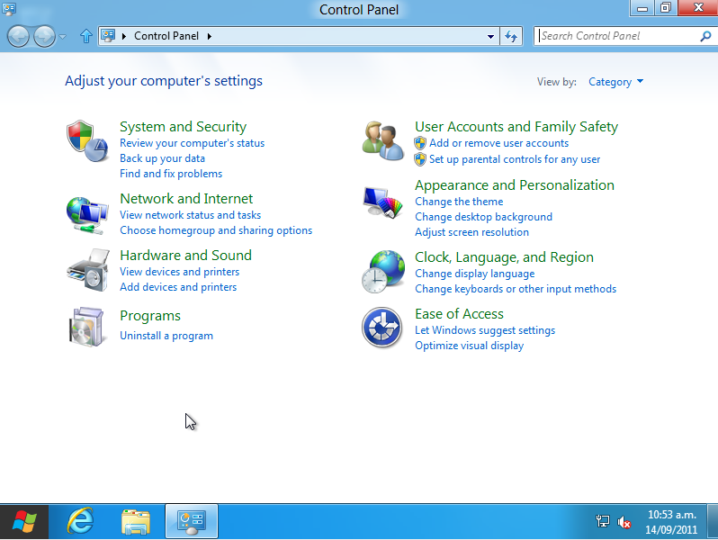
What is interesting is what happens when you launch a conventional application – I found myself suddenly watching some page flipping graphic animation and being taken to a familiar friend:
This probably highlights my single biggest complaint with Windows 8 – it’s not that they changed things, it’s that they didn’t change things _enough_.
IMHO, Microsoft should have thrown out the 1995 derived user interface and gone full on into this new Metro design – with a bit more work, I’m sure it could handle all the same needs just as well.
It’s like Microsoft was split into two teams – one wanting a design for 2011 and one wanting to retain the good old tried and tested design, but instead of either side winning, ended up with this weird dual mode operation.
Of course I’ve always argued that Microsoft should have moved to a BSD based backend like Apple did with MacOS – take the best from the open source world and then build their Windows libraries and APIs ontop of that platform – increase stability, reduced development in the low lever space and ability to move on from win32.
In terms of classic application UIs, a few old friends have had some UI changes, although maybe not so much for command line which has managed to survive a remarkable number of Windows releases whilst looking ugly as fuck.
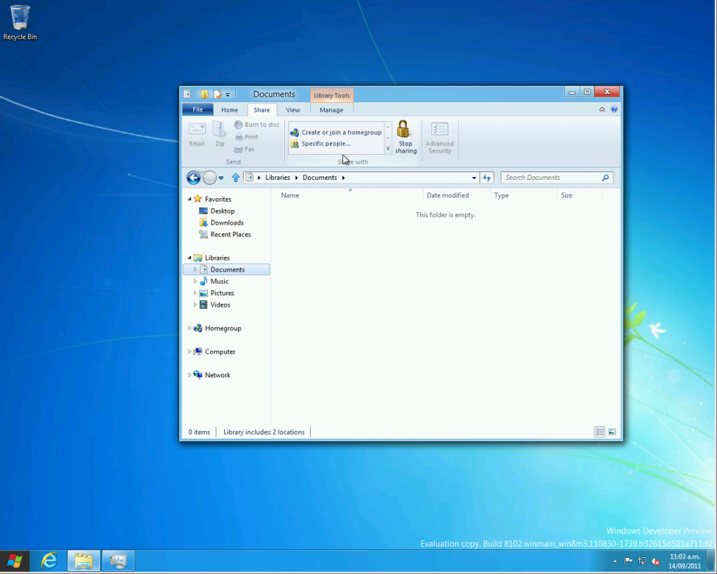
And of course, the controversial file manager UI changes feature:
Whilst I’m sure many readers will lynch me for this, I actually find the new ribbon style interfaces great – I suspect this is because I only really started using MS Office heavily with 2007+ and I found learning with the ribbon easier than with the traditional menu style layout.
Users having to learn new habits will probably hate it though and consider me mad for liking it. They should just harden up and use a CLI, always faster for a power user anyway.
Speaking of which….
Command Line, Fuck Yeah
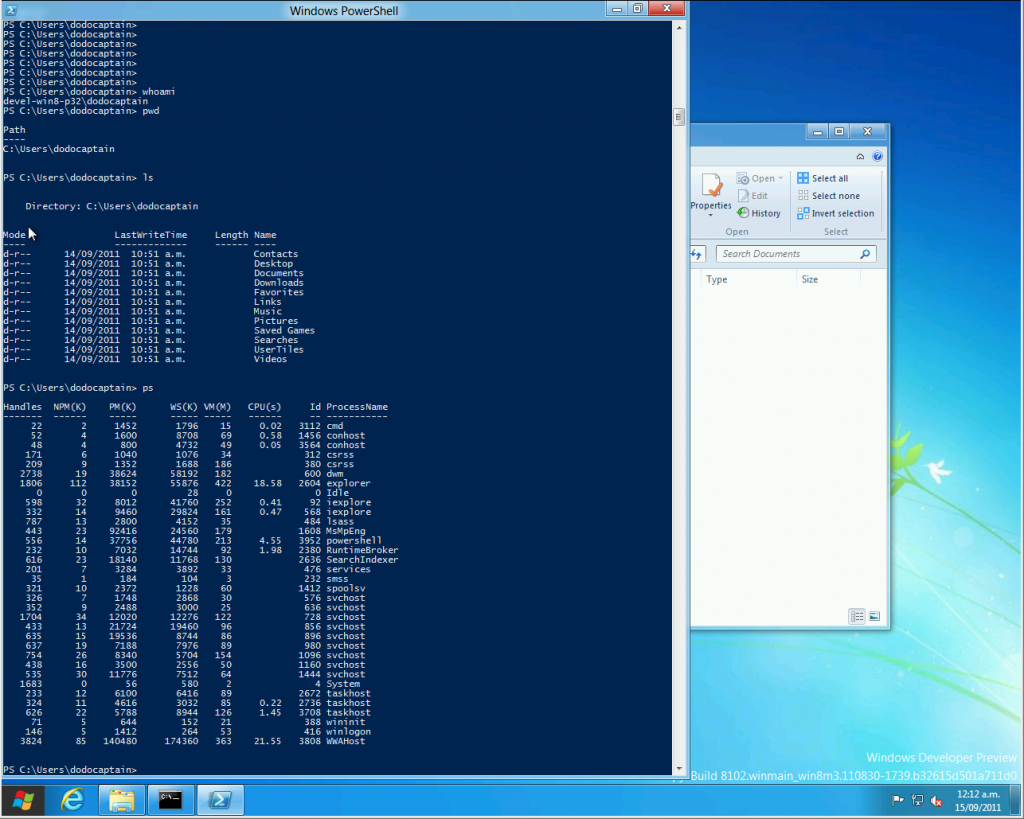
Apparantly Microsoft has had an improved shell around for a while to replace CommandLine, called Powershell – I won’t go into too much detail about it as it’s not really new to Windows 8, but do want to make some comments because it’s the first time I’ve had an actual play with it:
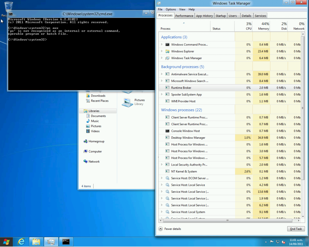
It essentially looks like they took some of the UNIX concepts and built a new shell for Windows that doesn’t entirely suck like the older one – hey, it even has a “ps” command and has other nix-isms like ls and pwd.
Sadly they didn’t implement the “uptime” command so you can’t compare days online without blue screens nor is there a “uname -r” for kernel version boasting contests. And as a helpful addition, I found a remarkable lack of –help parameter understanding.
Over all, it’s actually pretty nice – doesn’t stack up next to a modern Linux CLI, but miles better than the horror know as cmd.exe :-/
TBH, with Windows 8 they should dump the bloody command shell already and make people get with the program and adopt powershell – at worst it might break a couple batch files or some legacy launchers, but with the massive advantage that Linux geeks like me won’t be able to mock the crappy primary CLI so much. [5]
[5] I’m sure I’ll still find a way to mock Windows. :-)
Conclusion
Over all I found it an interesting system – it feels like they’re halfway between building a new style of desktop OS yet still have that legacy windows feel stuck behind it they just can’t shake.
I would often find myself dumped back to a somewhat Windows 7-like environment but with a funny acting start menu.
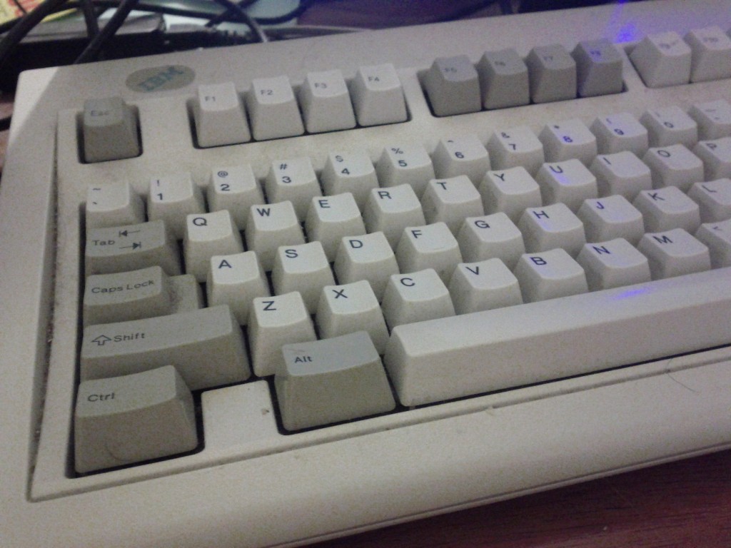
I did find the newer UI a bit more mouse intensive – having to cursor down and pause to get the start menu popup – however I suspect people with bad keyboards [6] will find that the Windows keys might make life easier to launch it.
[6] anything not an IBM Model M
I have yet to get into the real guts of the OS to see how it’s networking performs, how much memory it eats and how well legacy applications run – this might be tricky without paravirtualised drivers, since the emulated drivers do make an impact on performance.
In terms of quick checks at memory and CPU usage – with only a couple basic OS applications running, the VM was using about 400-500MB out of 1GB assigned and minimal CPU – probably around the same as a Windows 7 install, although maybe a bit less CPU wastage.
And in the hour I spent playing with it, I didn’t cause any nasty crashes – of course, once given real workloads and a variation of different applications and drivers, stuff will get more interesting. :-)
I’m genuinely optimistic about where MS is heading with Windows and their development in general – this is the first Windows release that I believe is accessible for the general public to download and play with, a more public development model will certainly pay off for them with community feedback, bug finding and also just general awareness and free marketing about Microsoft’s new capabilities.
Having said that, for a power user, there’s no way I’d move off Linux to Windows 8, even ignoring the philosophical differences, I still find the Windows architecture too restricting for my liking.
And developing for the new metro interface sounds like a trap for the unwary with restrictions similar to mobile application stores – not everyone shares my concern, but I’m extremely worried about heading into a future where the majority of commercial operating system vendors can control what applications are allowed to be released for their platforms.
In terms of the tablet audience, it will be interesting to see how it fares – whilst the iPad and Android tablets are going to pull off the tablet experience slicker/better (IMHO) the ability to run regular windows programs as the line between PC and tablet converges will certainly be attractive to some – and unlike Microsoft’s past forays into tablet computing, they’ve actually done more work than just slapping a touch screen onto a laptop and calling it done.
And that’s me for now – I may come back with some more on Windows 8 in the next few days, but I’ll prob be moving on to doing some reviews of weird *nix style operating systems I’ve been playing with.
